Xfinity Voice Education Strategy
Google Design Sprint + “What Can I say?”
EXECUTIVE SUMMARY
The Xfinity Voice Education project, which lasted four months, focused on improving customer engagement and retention by enhancing the way first-time customers learn about voice commands. As Design Lead, I conducted an in-depth audit, competitive analysis, and discovery research to identify gaps in the current voice education experience. Our team initially aimed to develop a full first-time customer experience, but after identifying key unknowns—such as content strategy and format—we pivoted to leverage the existing "What Can I Say?" (WCIS) feature as a learning tool.
I revamped the WCIS experience, refining the content strategy and visual design. I collaborated with cross-functional teams and led the implementation of tracking mechanisms to monitor customer interactions with the new design. The experiment yielded impressive results, with a 20% to 70% increase in promoted voice commands, and provided valuable insights into content strategy that could influence future product initiatives. The success of this project led to my voice education visual treatment being adopted across other Xfinity interfaces.
This case study demonstrates how customer education, data-driven decision-making, and collaborative design can drive measurable impact on customer engagement and product strategy.
CREDIT
Elijah Vargas - Creative Director
Amanda Olsovsky - Art Director
Cassandra Fellerman - Content Strategist
Samantha Emkes - Project Manager
Carolyn Reed - User Researcher
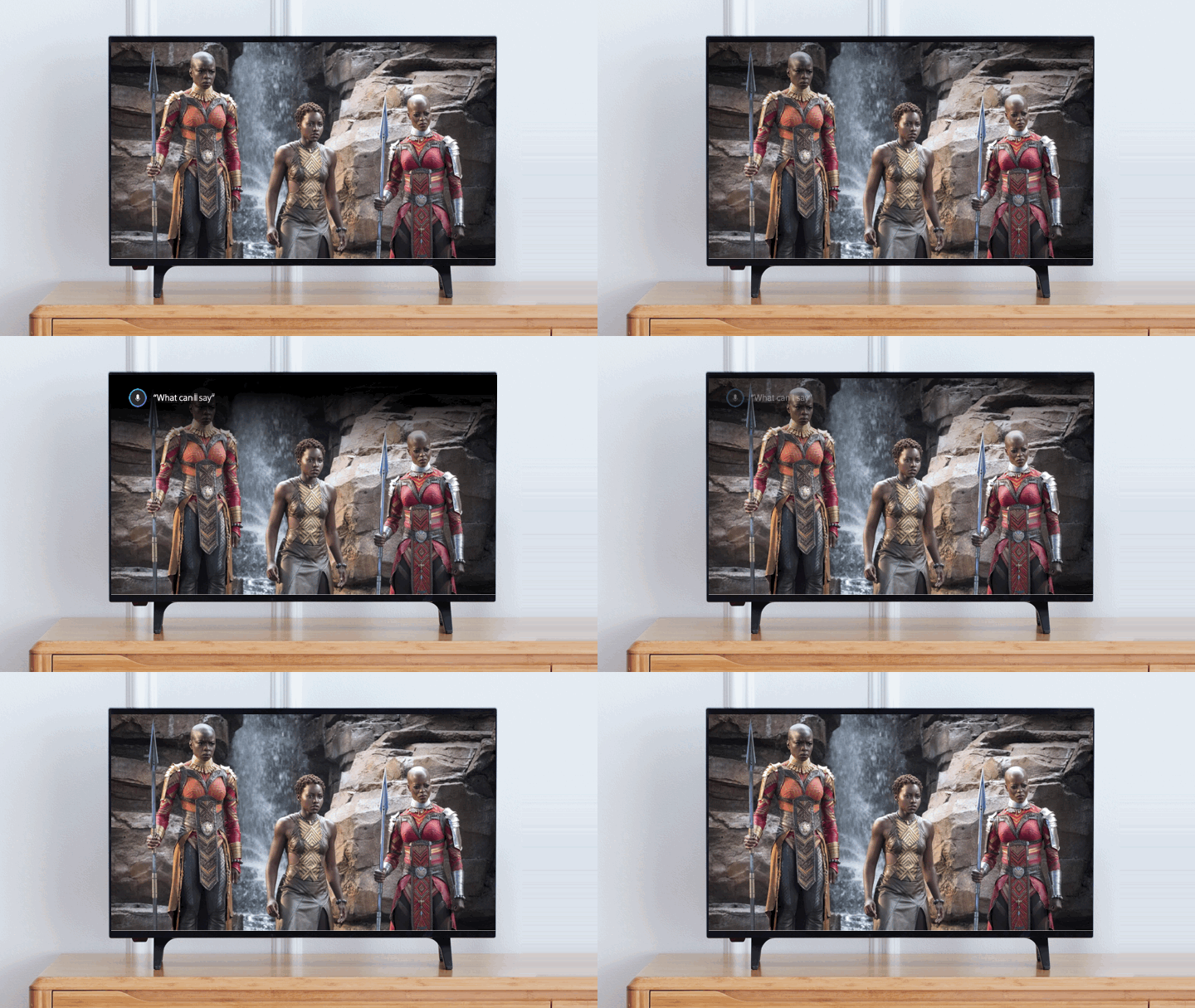
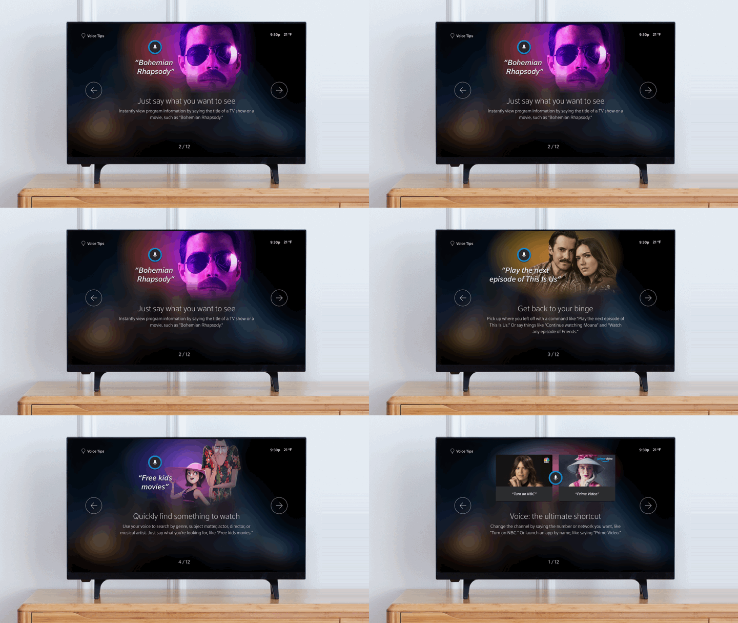
The new ”What can I say?” education carousel on Xfinity X1 platform
05 Design Sprint Workshop
06 ”What Can I Say?” experience
07 Experiment monitoring & Influcence without authority
08 Takeaways
06 ”What Can I Say?” experience
07 Experiment monitoring & Influcence without authority
08 Takeaways
01
BackgroundThe Xfinity Voice is a highly valued feature, with customers issuing over 13 billion voice commands in 2019 alone. Our research revealed a strong correlation between the number of voice commands used and customer engagement with linear TV. Moreover, voice usage not only enhances the overall experience but also significantly reduces churn, particularly in the critical first 30, 60, and 90 days. In fact, voice is the top feature driving customer recommendations for Xfinity.
However, we identified a growing challenge: the percentage of "voice-never" customers—those who had never used the Xfinity Voice feature—increased from 11% to 16% year-over-year. This made customer education a top priority for the Xfinity Voice team, particularly for new customers. Identifying the right content to educate first-time users, determining where in the customer journey to introduce it, and selecting the most effective delivery medium became crucial to both customer acquisition and retention for voice and Xfinity as a whole.
However, we identified a growing challenge: the percentage of "voice-never" customers—those who had never used the Xfinity Voice feature—increased from 11% to 16% year-over-year. This made customer education a top priority for the Xfinity Voice team, particularly for new customers. Identifying the right content to educate first-time users, determining where in the customer journey to introduce it, and selecting the most effective delivery medium became crucial to both customer acquisition and retention for voice and Xfinity as a whole.

Xfinity Set-top-box and voice remote
02
Team WorkflowAt that time, our team made a strategic shift from being feature-focused to becoming product-driven. We were no longer responsible for individual voice features but for overseeing the entire voice customer journey. This broadened our scope significantly, allowing us to collaborate with a diverse range of product managers, engineers, and designers across various disciplines.
With this expanded role, it became clear that our previous siloed, waterfall workflow was no longer practical or efficient. I recognized the need for a more collaborative approach that allowed us to learn quickly and shorten our feedback loop, ultimately enabling us to respond to user needs more effectively.
![]()
A friend recommended Design Sprint by Jake Knapp, which is based on the Design Thinking process. This five-day framework, developed by Google Ventures, is designed to tackle critical business questions through design, prototyping, and testing. After reading the book, I selected key exercises from the Design Sprint process and organized a workshop focused on the first three days: Understand, Ideate, and Vote. I proposed this approach to leadership, and they agreed to implement it for the voice education project. Since then, it has become a valuable tool in our process.
With this expanded role, it became clear that our previous siloed, waterfall workflow was no longer practical or efficient. I recognized the need for a more collaborative approach that allowed us to learn quickly and shorten our feedback loop, ultimately enabling us to respond to user needs more effectively.

03
Design ChallengeTogether with our Product partner, we defined the core challenge for the project:
I was tasked as the Design Lead for this project. This was a typical scenario I often encountered at Comcast—taking an extensive, loosely defined concept from our Product team and translating it into a clear, tangible goal with measurable design solutions.
“How might we provide Xfinity first-time voice customers with the tools and resources they need to be successful using voice throughout the Xfinity experience?
I was tasked as the Design Lead for this project. This was a typical scenario I often encountered at Comcast—taking an extensive, loosely defined concept from our Product team and translating it into a clear, tangible goal with measurable design solutions.
04
Audit, Competitive Analysis & ResearchI began by conducting an in-depth audit and competitive analysis, focusing not only on our Xfinity product line but also exploring smart displays and other voice-enabled entertainment products. I examined these products from various angles, including interaction design, content strategy, visual treatment, and online documentation.
Before diving into the audit, I took the time to clearly define research outputs and formulate research questions. This deliberate approach allowed me to stay focused and efficiently find the information I was seeking.
A couple example of questions that I wrote:
Before diving into the audit, I took the time to clearly define research outputs and formulate research questions. This deliberate approach allowed me to stay focused and efficiently find the information I was seeking.
A couple example of questions that I wrote:
- How is the current First-Time User Experience (FTUE) on Xfinity? Are we doing any voice education at this stage? What constraints might be limiting us?
- How are our direct and indirect competitors approaching this?
- Are there any assumptions that need to be validated by the research team?
- What opportunities for improvement exist?


Fire TV (left) and Google Home Hub (right) first time user experience

Xfinity Set-Top-Box first time user experience - Entire flow (left) vs Voice education screens (right)
A couple key takeaways from the audit were:
-
Xfinity’s First-Time User Experience (FTUE) fell short compared to competitors. While other platforms offered immersive voice education, Xfinity provided only a basic activation setup flow with feature promotional loading screens. These screens were copy-heavy, with voice commands visually deprioritized. Additionally, there was a misalignment between the user experience and what was communicated on our marketing and customer service websites. It’s also worth noting that most of our set-top boxes (STBs) are installed by technicians during internet setup, meaning customers had minimal exposure to these screens.
- Competitors like Fire TV and Google excelled in voice education for first-time customers. After setup, customers were presented with a video that walked them through key use cases, demonstrating how Alexa or Google could serve as an AI assistant in their daily lives. Both platforms prominently featured the "What Can I Say?" (WCIS) voice command as a dedicated experience to educate users on voice functionalities.
I then looked into whether Xfinity offered a similar WCIS experience. I discovered that we do offer this feature (shown below). When customers say the voice command, they are presented with a carousel of 10 slides, each showcasing different voice commands under various themes. Customers can navigate through these slides using the arrow buttons on the voice remote.

Xfinity What Can I Say carousel
After completing the audit, I collaborated with my data scientist partner to analyze the voice usage landscape. The chart below highlights the top voice command categories.
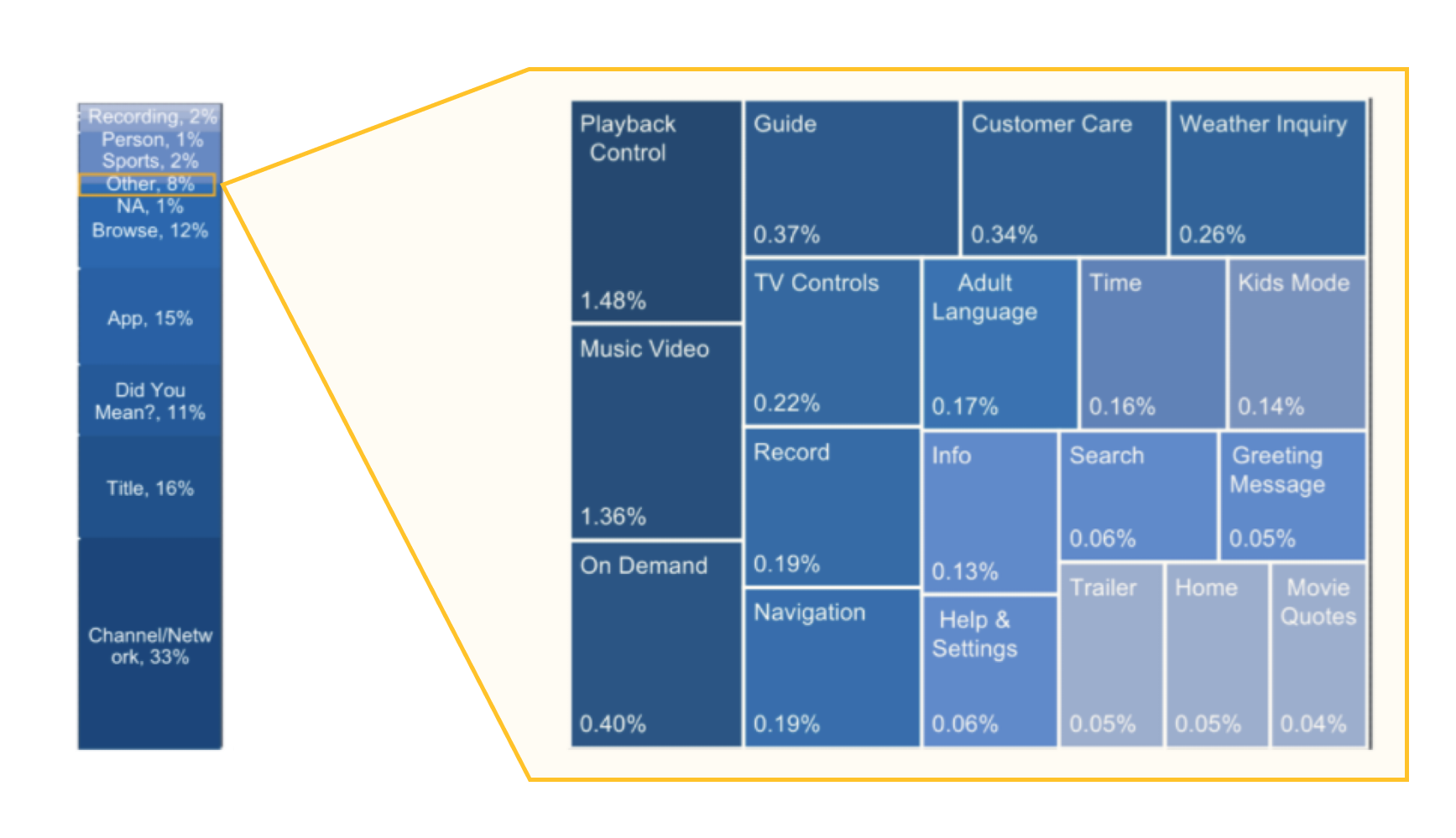

Xfinity voice usage categories (left) - Voice Discovery Research output (right)
As expected, the top categories were straightforward: channel or network commands ("ABC"), title commands ("Game of Thrones"), and app-related commands ("YouTube"). However, what caught my attention was the "Other" category, which accounted for utility and AI assistance-focused voice commands, such as "Restart my system," "What's the weather today?" or "What is my Wi-Fi password?". Although this category only represented 8% of overall usage, it sparked an idea: beyond traditional voice commands like channel tuning or title searches, what if we introduced customers to these utility and assistance commands during onboarding?
With this in mind, I collaborated closely with my research partner on a discovery study where we interviewed 41 Xfinity voice customers to understand their motivations for using voice and the mechanisms they found helpful for learning about voice features and commands. The key findings from our research revealed that customers primarily use voice when they already know what they want to watch, leveraging it as a shortcut. They don’t actively seek to use their TV time to learn about the full range of voice capabilities but do appreciate well-timed tips that align with their immediate tasks.
With sufficient insights from data analysis, user behaviors, and the market landscape, I gathered the team and facilitated a Design Sprint Workshop to move forward with defining and ideating solutions.
05
Design Sprint WorkshopA. SETTING THE STAGE
I invited designers, developers, and product managers to the workshop, ensuring a diverse group and avoiding a room full of just designers. One key takeaway from the book was to invite the right people to the Design Sprint. I kicked off the workshop with an audit and research readout, giving the team a comprehensive understanding of the design problem and what we aimed to solve.
To get the team engaged, I facilitated an improvisation exercise called "Network Map." I asked the team to identify where we currently offer voice education and where we could or should expand in the future. This exercise helped warm up the group and framed our discussions, providing a holistic view of our voice education strategy moving forward.
![Network Map Exercise]()
Network Map exercice - Voice Education area of opportunites
B. CRAFTING A HIGH LEVEL FIRST-TIME VOICE USER JOURNEY
The second exercice that I used were the “User Journey” exercice: a flowchart showing main touchpoints where your customers, discover and use your product. Key players are on the left-hand side, and your goal is on the right side. As our product manager and our engineer were there, it didn’t take us long to finish the map .
![]()
User journey exercice - High level first-time voice user journey
Next, we moved on to the "How Might We" (HMW) note exercise. The goal was to transform the challenges and insights from the audit and research readout into opportunities, which we captured on sticky notes. One of the tricky aspects of writing HMW notes was ensuring they weren't too narrow, which could prescribe the solution, or too broad, which could generate a flood of ideas outside the project's scope.
C. DECIDING ON A FOCUS AREA
Once all the HMW notes were gathered and placed on the wall, I asked the team to take time to read through them, pick the ones they found most relevant, and group similar ideas together. We then voted on the notes we believed addressed key challenges, and the most voted-on ideas were added back to the map. While each team member had their own assumptions about which part of the experience was causing the most issues, this exercise clearly revealed the actual pain points and helped us prioritize which to tackle first. The result was a clear focus area and a sense of priority for moving forward.
![]()
First-time voice user journey with voted HMW notes
It might seem cliché to go through an audit, research readout, and three different exercises just to reach this point. But as a Lead Designer, gathering your team, effectively communicating insights to ensure everyone understands the why, aligning the team, and keeping the conversation flowing is just as crucial as solving the design problems themselves, right? ︎
I invited designers, developers, and product managers to the workshop, ensuring a diverse group and avoiding a room full of just designers. One key takeaway from the book was to invite the right people to the Design Sprint. I kicked off the workshop with an audit and research readout, giving the team a comprehensive understanding of the design problem and what we aimed to solve.
To get the team engaged, I facilitated an improvisation exercise called "Network Map." I asked the team to identify where we currently offer voice education and where we could or should expand in the future. This exercise helped warm up the group and framed our discussions, providing a holistic view of our voice education strategy moving forward.
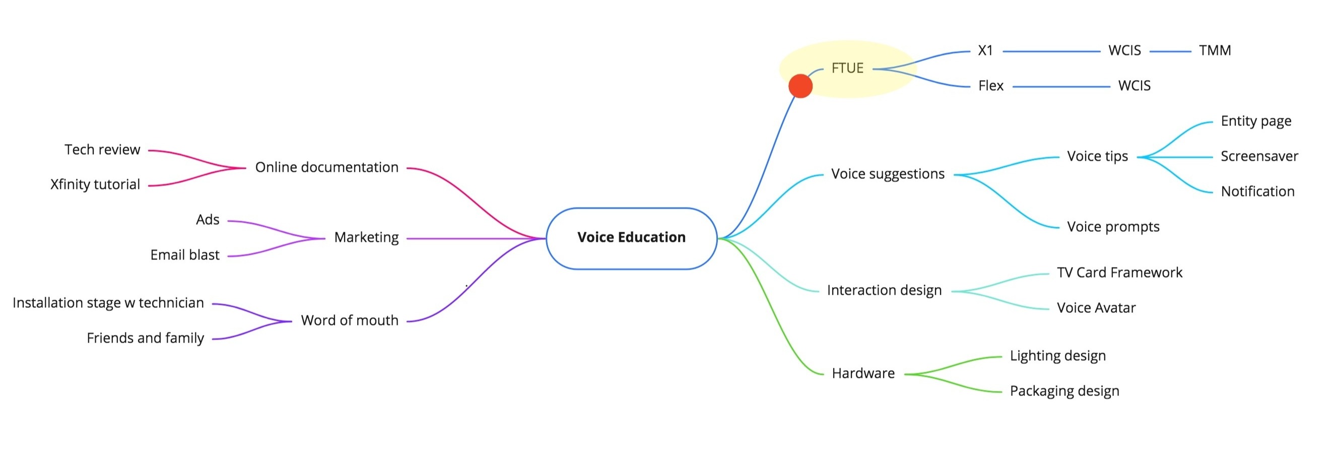
Network Map exercice - Voice Education area of opportunites
The second exercice that I used were the “User Journey” exercice: a flowchart showing main touchpoints where your customers, discover and use your product. Key players are on the left-hand side, and your goal is on the right side. As our product manager and our engineer were there, it didn’t take us long to finish the map .

User journey exercice - High level first-time voice user journey
C. DECIDING ON A FOCUS AREA
Once all the HMW notes were gathered and placed on the wall, I asked the team to take time to read through them, pick the ones they found most relevant, and group similar ideas together. We then voted on the notes we believed addressed key challenges, and the most voted-on ideas were added back to the map. While each team member had their own assumptions about which part of the experience was causing the most issues, this exercise clearly revealed the actual pain points and helped us prioritize which to tackle first. The result was a clear focus area and a sense of priority for moving forward.

First-time voice user journey with voted HMW notes
It might seem cliché to go through an audit, research readout, and three different exercises just to reach this point. But as a Lead Designer, gathering your team, effectively communicating insights to ensure everyone understands the why, aligning the team, and keeping the conversation flowing is just as crucial as solving the design problems themselves, right? ︎
06
“What Can I Say?” experienceA. PIVOTING BASED ON IMPACT AND EFFORT
While developing a comprehensive first-time user experience remained our ultimate goal, we first needed to address two key unknowns: content strategy—understanding which topics would be most valuable for customers to learn—and format—deciding whether video, games, or static screens would be the best medium for teaching voice features.
Following the last exercise, voice education emerged as the primary focus. Given the uncertainties around content strategy and format, the team decided to pivot and leverage the existing "What Can I Say?" (WCIS) experience as a learning tool rather than building a new first-time user experience from scratch, which could become costly. The value propositions and content strategy for voice education could be applied across different formats and easily adapted to future projects. Although we were using the WCIS experience as a learning opportunity, we anticipated that it would have a positive impact on voice adoption, engagement, and retention rates.
The current WCIS experience consists of a 10-slide carousel that introduces customers to key voice features, which can be accessed by saying "What Can I Say?" into the voice remote or selecting it from the help menu.

Impact Effort Matrix
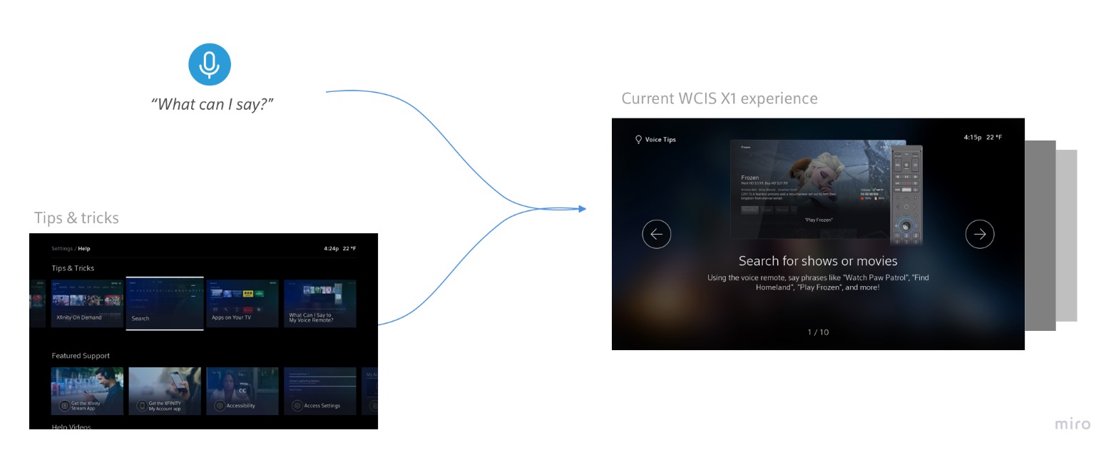
“What Can I Say?” experience flow
B. CONTENT FIRST

I also collaborated with Cassie, our UX writer, to refine the language and tone of the copy, ensuring it aligned with the Xfinity brand voice.
C. DESIGN SECOND
On the visual side, this was where I worked independently—focusing on what designers do best. Due to the limitations of the carousel template, I could only modify the copy and swap out the artwork. I went through several rounds of visual exploration, from conventional to playful, ultimately landing on a design that struck a balance. The final designs stayed true to the Xfinity brand identity while allowing for scalability and easy templatization (see green check marks in the photo below).
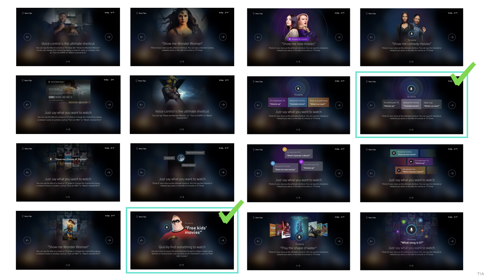
 Visual design exploration examples (top) - Artwork design template system and application (bottom)
Compositional flow dictates how the eye moves through a design: where it looks first, where it pauses, and how long it stays. With this new approach, I added hierarchy, direction, movement, and rhythm, guiding the customer’s eye from the most important elements to the least. This improved visual treatment creates a clearer path for users to engage with the content.


Compositional flow of “What Can I Say?” screens (top) and WCIS new visual language (bottom)
07
Experiment monitoring & Influence without authority
I collaborated with my engineering partner to establish tracking mechanisms for the new design, which we rolled out as a 90-day experiment. The team implemented tools to monitor key metrics, including impressions, conversion rates, how far customers progressed through the carousel slides, and most importantly, their actions—specifically voice commands—after exiting the updated WCIS experience.
![]()
Within the first month of the experiment, we observed a significant increase—ranging from 20% to 70%—in the usage of voice commands promoted on the carousel slides. Customers also began creatively adapting the commands, such as saying "Turn on CNN" instead of "Turn on NBC" or "Free Sci-fi movies" instead of "Free kids movies." One command that saw consistent growth was "What should I watch?"
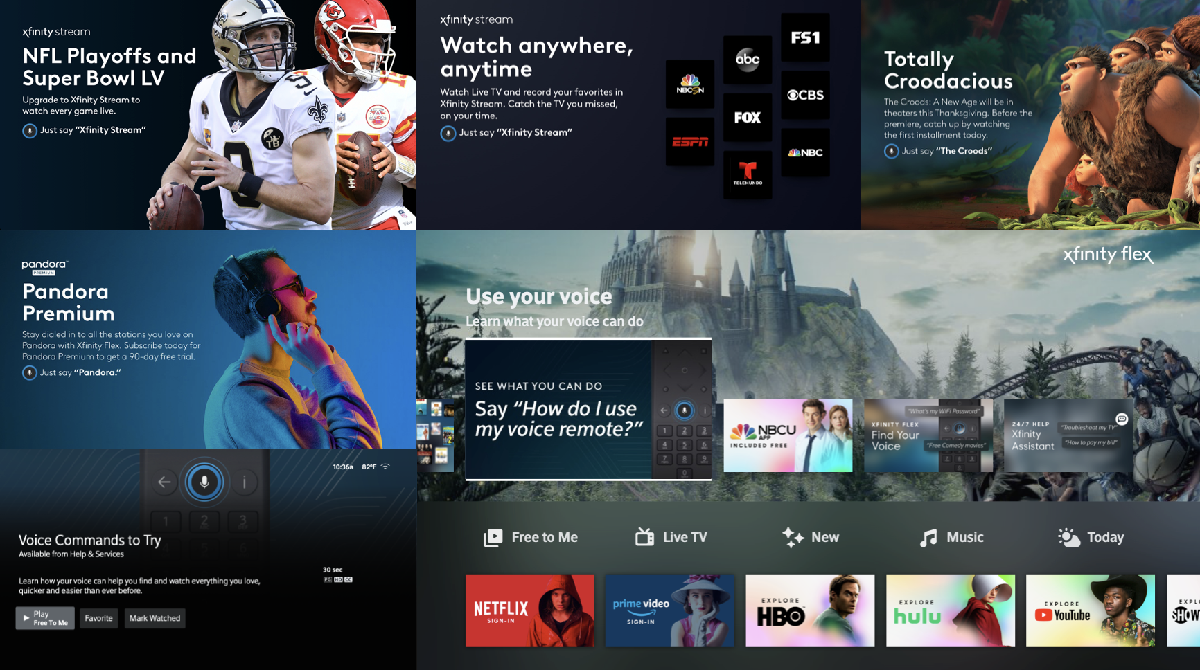
The experiment was a clear success. Not only did we boost voice engagement, but the content strategy insights gained from this project can be applied to future initiatives and may influence our broader product strategy. I presented the project outcomes to the larger design team, and my voice education visual treatment was adopted across multiple interfaces - image below.
![]()

Within the first month of the experiment, we observed a significant increase—ranging from 20% to 70%—in the usage of voice commands promoted on the carousel slides. Customers also began creatively adapting the commands, such as saying "Turn on CNN" instead of "Turn on NBC" or "Free Sci-fi movies" instead of "Free kids movies." One command that saw consistent growth was "What should I watch?"
The experiment was a clear success. Not only did we boost voice engagement, but the content strategy insights gained from this project can be applied to future initiatives and may influence our broader product strategy. I presented the project outcomes to the larger design team, and my voice education visual treatment was adopted across multiple interfaces - image below.
08
TakeawaysCommunication and close collaboration between product, design, and engineering allowed us to move swiftly and function as a cohesive team. Here are a few key lessons I learned throughout the process:
Break it down into smaller parts
Although we didn’t tackle the ultimate first-time user experience (FTUE), the insights from the WCIS experiment helped us narrow down our content strategy for future projects. Similarly, we didn’t use the full Design Sprint process but rather leveraged it as a catalyst to get ideas flowing. By breaking it into smaller chunks and selecting the right exercises for the team, we maintained focus and momentum.
Done is better than perfect
I believe in getting designs in front of customers or into A/B tests early to gather feedback, rather than iterating in isolation for hours. UX design is never truly "perfect," and it's important to embrace that—let the customers help you get closer to the right solution.
Influence without authority
As a designer, your superpower isn’t just in the product you own, but in your ability to influence how the entire organization approaches challenges and makes decisions.
