PhillyCHI Design Leadership
Brand Strategy & Visual Identity
EXECUTIVE SUMMARY
The PhillyCHI rebranding project aimed to revitalize the visual identity of the organization in celebration of its 15th anniversary. As the 2020 Chair and Creative Director, I led the effort to redefine PhillyCHI’s brand strategy, update the mission statement, and establish core values that aligned with the organization’s vision. Collaborating with a team of brand designers, I oversaw the creation of a bold, flexible visual system inspired by Philadelphia’s neighborhoods and iconic murals. This eight-month process resulted in a refreshed brand identity that authentically represents PhillyCHI’s mission and resonates with the local UX community.
Key achievements included aligning the brand with PhillyCHI’s core values—Inclusion, Connection, Relevance, and Compassion—and delivering a flexible, future-proof visual system that will evolve with the organization. This project taught me valuable lessons in leadership, communication, and balancing design craft with strategic business goals.
CREDIT
Hanh Huynh - Brand Designer
Salome Younes - Brand Designer
Ben Swofford - UX Writer
Jermaine Boca - Art Director
Tim Gough - Mentor
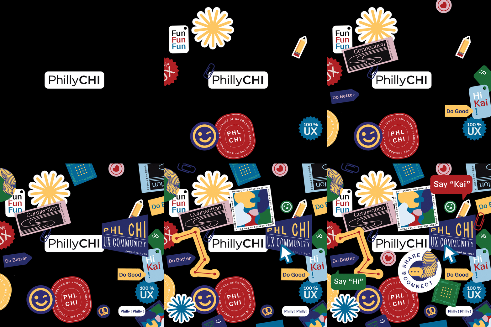
PhillyCHI new branding sticker animation

PhillyCHI Branding Before (left) vs After (right)
Founded in 2005 in the City of Brotherly Love, the Philadelphia chapter of ACM SIGCHI — known as PhillyCHI — aims to create an environment for UX professionals, students, and enthusiasts of varying backgrounds and experience levels to make connections and learn as a community.
PhillyCHI is a volunteer-lead, member-driven organization that has 35 percent surge in attendance within the past four years and a boost in sponsorship backing.
The year 2020 marked a significant milestone for PhillyCHI, as it celebrated its 15th anniversary of advancing the UX discipline and uniting the UX community in Philadelphia.
The year 2020 marked a significant milestone for PhillyCHI, as it celebrated its 15th anniversary of advancing the UX discipline and uniting the UX community in Philadelphia.
02
Design Challenge
The current board includes four officers who serve one-year terms. The board is responsible for leading the Chapter and managing all activities. Due to limited bandwidth, the organization’s brand presence had been underdeveloped. This project aimed to redesign PhillyCHI’s visual identity to strengthen its brand strategy and enhance visibility within the community.
"How might we define and design a new brand identity that not only effectively communicates PhillyCHI’s mission but also elevates its core values and reflects the dynamic energy of the community it represents?"
03
Research & Brand StrategyAs the PhillyCHI 2020 Chair and Creative Director of the rebranding project, I was uniquely positioned to understand the needs from both an organizational and design perspective. This dual role allowed me to act as a bridge, ensuring alignment between the board’s vision and the creative direction. Before engaging with our brand designers, I prioritized establishing a solid brand strategy, collaborating with the team from day one. A well-defined brand strategy would not only guide our business decisions and ensure consistency, but more importantly, keep the team aligned. It would also provide clarity for our future brand designers on what PhillyCHI aims to achieve.
We began by addressing key foundational questions:
To answer these, we conducted extensive research through interviews, surveys, and data analysis. This research phase was crucial—it confirmed who our audience is, their perceptions of our events, their expectations, and what truly sets PhillyCHI apart from other UX organizations in the area.
![]()
![]()
After completing the research phase, I brought the team together with clear answers to all our foundational questions. I led the effort to update our mission statement and refine our core values, as the old mission statement no longer reflected who PhillyCHI had become. With the new mission statement, I aimed to clearly articulate who we are, who we serve, what we do, why we do it, and how we accomplish it.
Inspired by Simon Sinek’s renowned Tedx talk, "People don't buy what you do; they buy why you do it," I knew that defining our purpose was critical. While it was challenging to condense all these elements into a single statement, I am thrilled with the clarity and alignment we achieved.
We began by addressing key foundational questions:
- What are we?
-
Why are we doing what we’re doing? What is our mission/purpose?
-
What are our core values?
-
Who is our audience, and how do we serve them?
- What makes us different from the other local UX organizations?
To answer these, we conducted extensive research through interviews, surveys, and data analysis. This research phase was crucial—it confirmed who our audience is, their perceptions of our events, their expectations, and what truly sets PhillyCHI apart from other UX organizations in the area.
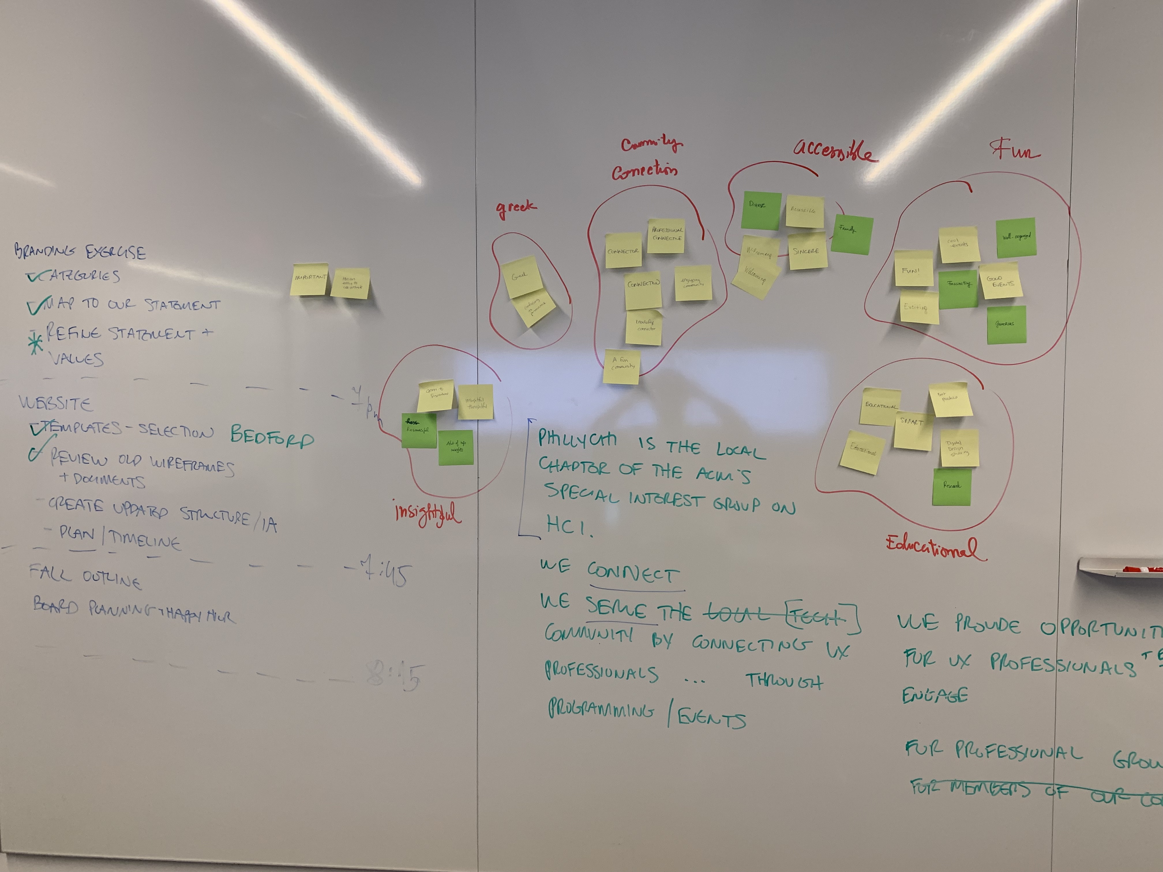

Left photo - / Right photo - Sticky notes describing our organization posted by attendees at our events
After completing the research phase, I brought the team together with clear answers to all our foundational questions. I led the effort to update our mission statement and refine our core values, as the old mission statement no longer reflected who PhillyCHI had become. With the new mission statement, I aimed to clearly articulate who we are, who we serve, what we do, why we do it, and how we accomplish it.
Inspired by Simon Sinek’s renowned Tedx talk, "People don't buy what you do; they buy why you do it," I knew that defining our purpose was critical. While it was challenging to condense all these elements into a single statement, I am thrilled with the clarity and alignment we achieved.
Old Mission Statement
PhillyCHI is the Philadelphia region's chapter of the ACM SIGCHI, an interdisciplinary group dedicated to advancing human-computer interaction and user experience as a professional discipline, and to building a community of UX professionals, students, and enthusiasts.
Updated Mission Statement
PhillyCHI is an interdisciplinary group committed to advancing UX (Computer-Human Interaction) as a professional discipline and to strengthening the Philadelphia UX community through regular educational programming and networking opportunities. We dedicate our work to a culture of knowledge sharing and community building.

Adjectives that our members used to describe our organization and our events. The ones in blue were the sticky ones which we also chose as brand attributes.
I felt fortunate that PhillyCHI already had a strong presence within the local UX community, which was reflected in the positive adjectives we gathered during our research—shown in the image above. These adjectives became essential touchpoints, guiding us in defining our core values and shaping the attributes for our new brand identity.
Inclusion
Connection
Relevance
Compassion
After a couple of rounds of discussion, we settled on Inclusion - Connection - Relevance - Compassion as our core values. These values are not only meaningful to our organization but also actionable. They complete our purpose and mission statement, clearly communicate what we stand for, and serve as a guiding North Star for business decisions and strategic trade-offs.
04
Creative BriefWith our brand strategy in place, I assembled a team of brand designers and delivered the creative brief—a comprehensive collection of information outlining what PhillyCHI is, who our audience is, and what we aimed to achieve through the rebrand. I provided a high-level overview of the project, including our brand strategy, attributes, and creative guidelines, ensuring the designers had a clear understanding of their task. To give them context, I also invited them to PhillyCHI events so they could experience the community firsthand.
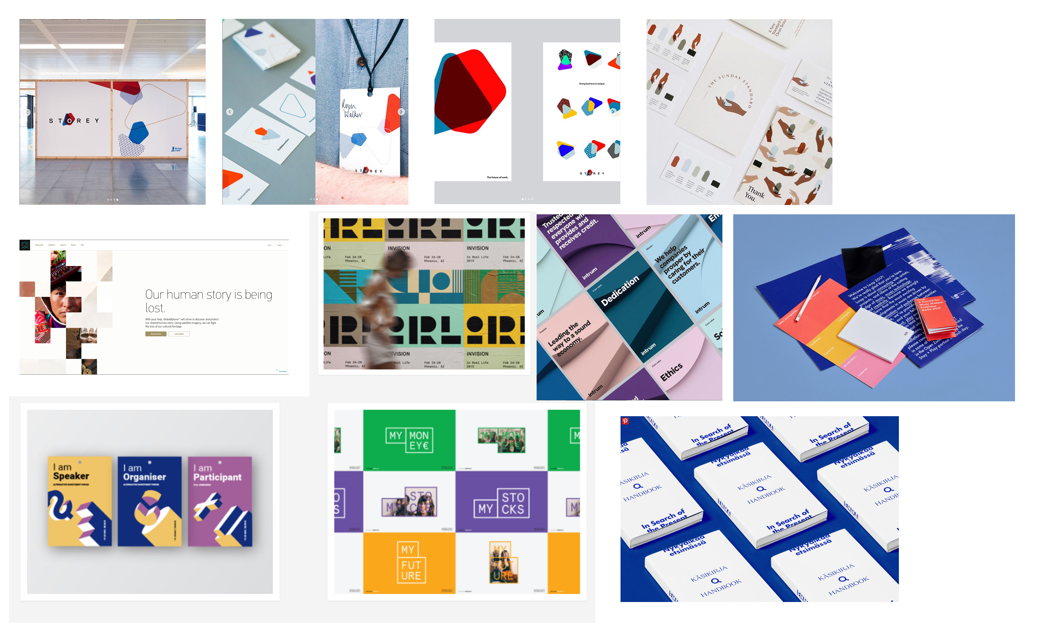
Using the creative brief as a foundation, the designers and I collaborated on a mood board, exploring three distinct brand directions for PhillyCHI. We presented these concepts to the team, explaining the rationale behind each one. Ultimately, we decided to combine elements from all three: the colorful abstract shapes from Concept 1, the airy feel from Concept 2, and the modern touch of black from Concept 3, creating a hybrid version that resonated with our vision.
![Concept 1- Colorful abstract]()
![Concept 2- Splash of colors]()
![Concept 3- Minimal technologist]()
Using the creative brief as a foundation, the designers and I collaborated on a mood board, exploring three distinct brand directions for PhillyCHI. We presented these concepts to the team, explaining the rationale behind each one. Ultimately, we decided to combine elements from all three: the colorful abstract shapes from Concept 1, the airy feel from Concept 2, and the modern touch of black from Concept 3, creating a hybrid version that resonated with our vision.


05
Identity
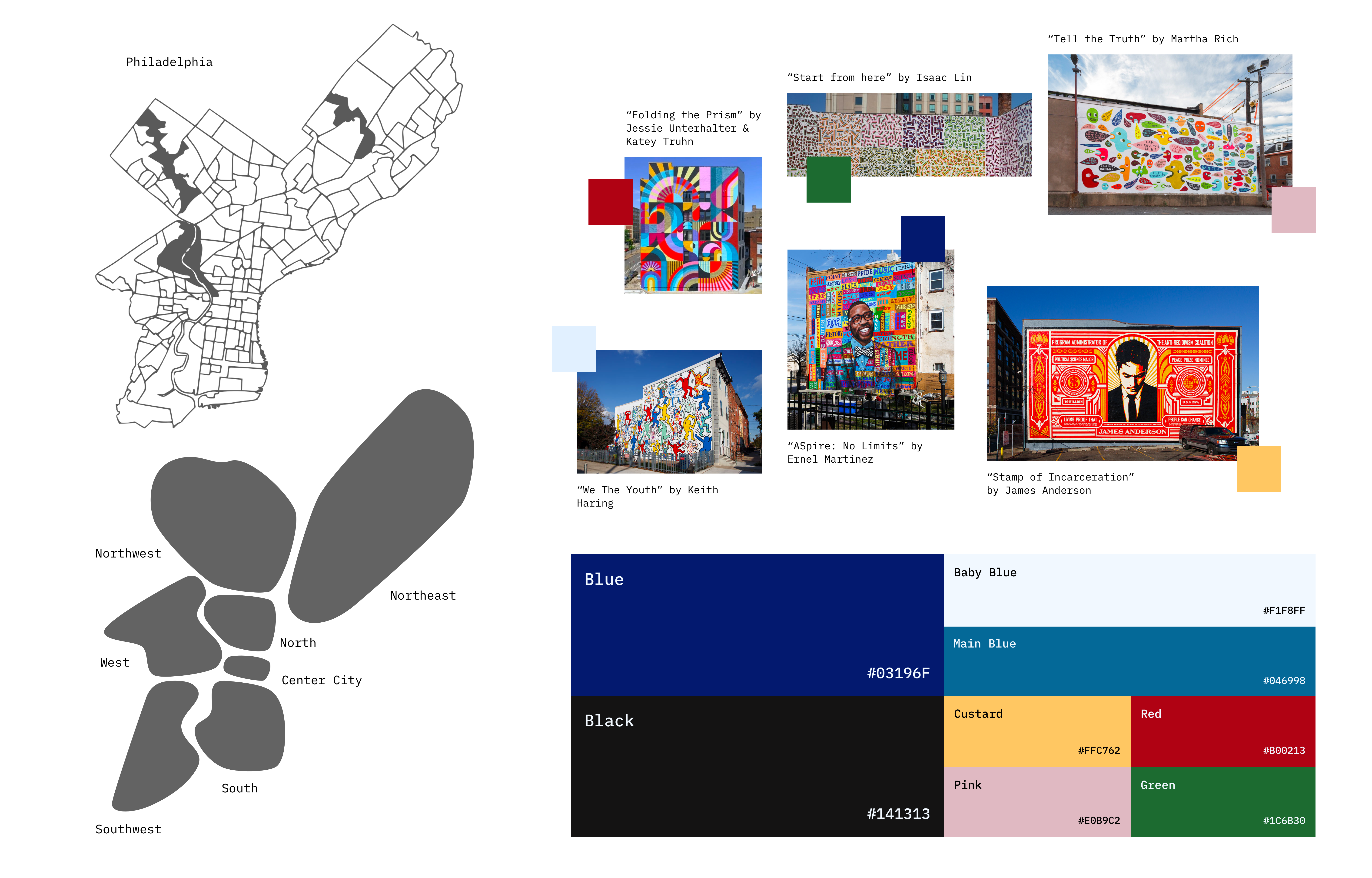
Our goal was to create a brand identity and visual style that felt authentic, relevant, and distinct. One of our top priorities was paying homage to the UX community and the vibrant energy surrounding PhillyCHI. The abstract shapes we developed, inspired by the unique profiles of different Philadelphia neighborhoods, became key graphical elements for the brand. We also drew inspiration from Philadelphia’s iconic murals when selecting our primary colors, opting for bright and warm tones that reflect the city's dynamic spirit.
![]()
![]()

06
Typography
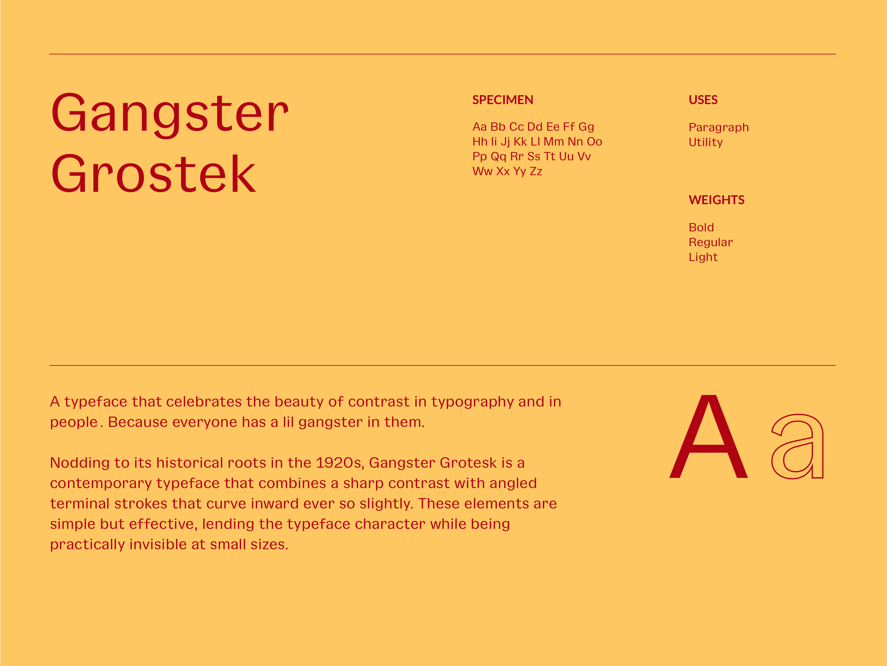
We chose to pair the playful regular weight of Pangram Pangram’s Woodland with the clean and edgy Gangster Grotesk for body copy and smaller text-based details. Woodland, as a minimal sans-serif font, was ideal for legibility and worked particularly well with large, oversized headlines, creating a balance between readability and visual impact.
![]()
![]()
![]()


07
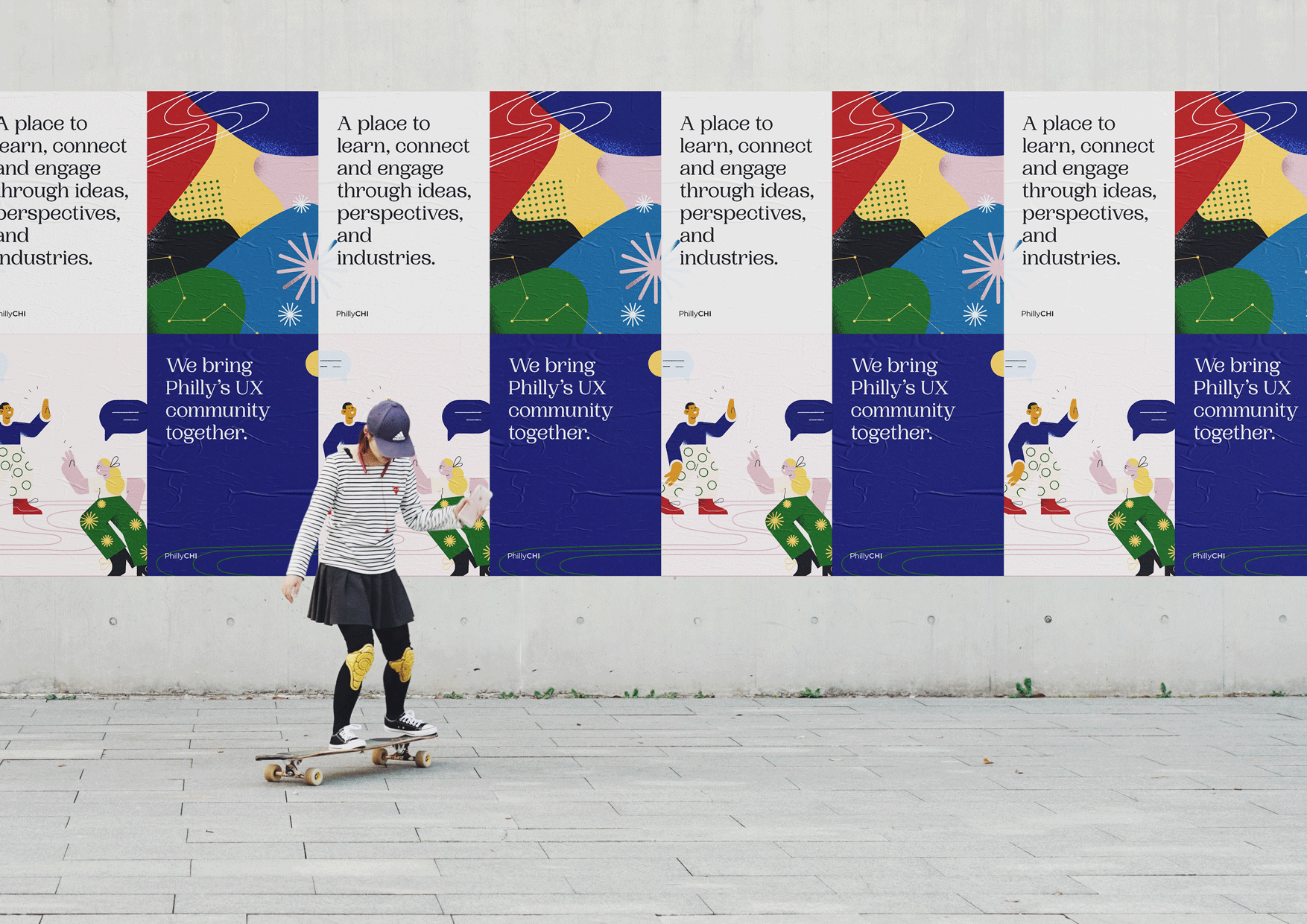
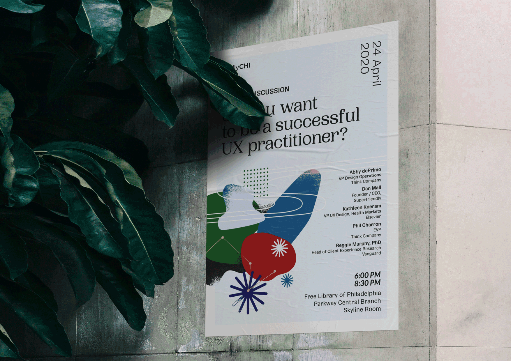
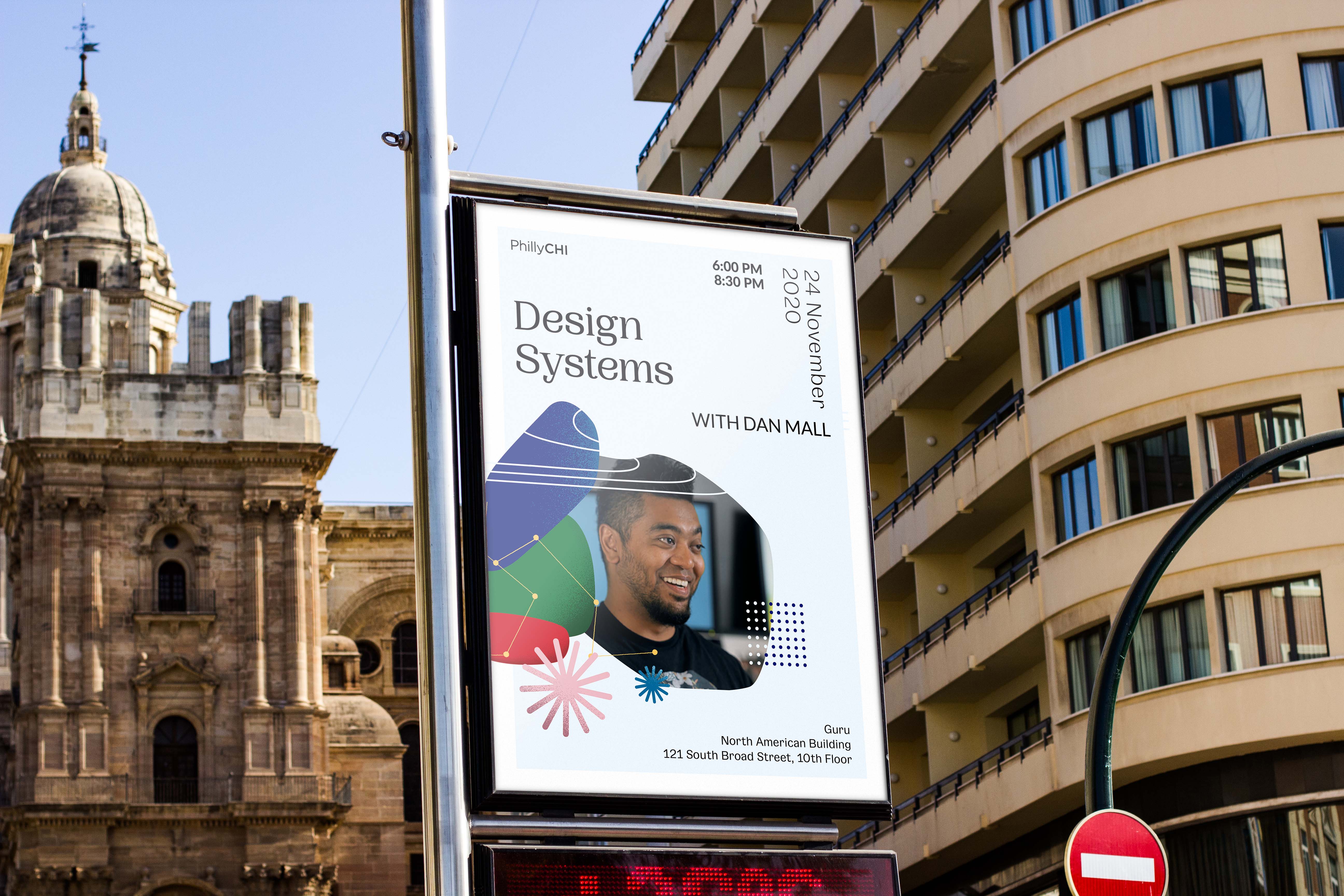
Illustration & Visual SystemWe developed a bold and distinctive visual system that aligned with our brand attributes and the initial direction we envisioned. The colorful abstract shapes provided great flexibility, allowing them to be assembled in various ways depending on the tone, context, and medium. This adaptable system gave us the ability to dial the visual intensity up or down as needed. Importantly, it leaves room for the brand to evolve and change in the future.
![]()
![]()
![]()
![]()
![]()
![]()
![]()
![]()
![]()



08
TakeawaysThe entire rebranding effort took eight months to complete, and I’m incredibly proud of the work my team accomplished and the process we went through—from defining the brand strategy and revisiting the mission statement, to creating core values, assembling a team of brand designers, and crafting the entire visual identity from scratch.
Here are things that I have learned throughout the process:
Keep your head high.
This project required me to wear multiple hats, which pushed me to maintain a broad perspective while switching between roles. As a designer, it's easy to get caught up in perfecting small details, but as a creative director, I had to ensure the overall visual representation not only looked good but also aligned with the client’s business goals.
Communication is king.
Maintaining transparency was a top priority. Since our team worked remotely for most of the project, clear communication was essential in ensuring everyone stayed aligned on the design challenges and focused on the right tasks.
Instead of making it right, start doing it.
At times, it felt like we’d never finish the project. Breaking it down into smaller, manageable tasks made progress achievable. We also spent time defining success upfront to avoid unnecessary back-and-forth discussions, ensuring that the project stayed on track.